After the war, Poland was at the very bottom of society. The identify of this country had taken a toll, and it had become clear that Poland's image was not their own anymore. While Soviet's influence took over Poland, there were some people who never lost hope in Poland and its culture. During this time, there were very few art schools available due to the limited jobs available (Meggs). Tadeusz Trepkowski was one of the few people who emerged out of these dark times in the result of a terrible circumstance. When looking at Tadeusz Trepkowski's artwork many of these posters have a succinct and dynamic composition.
 '
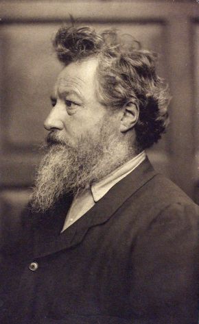
'Trepkowski 1937
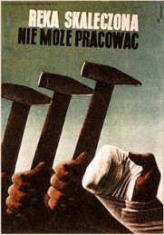
Before the war, Tadeusz Trepkowski was largely a self taught artist, that focused on simple poster that focuesed on objects. He created public service posted. One of the most famous pre-war posters is three hammers-holding hands, and a fourth injured hand. This symbolizes that an injured hand cannot do work (Rzepkowski).

Trepkowski 1953
One of Tadeusz Trepkowski more well known posters is the one seen above, called Nie! in 1952 (MoMA). Tadeusz Trepkowski's goal in his work was to capture the memory of the destruction of World War II. Through Tadeusz Trepkowski's posters, the artist had given back pride to Poland. Through his posters, Tadeusz Trepkowski communicated with the people of Poland, giving them a sense of pride once more ("Tadeusz Trepkowski").
Trepkowski 1955
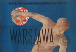
Tadeusz Trepkowski's style in his posters were straightforward composition and pure color. This can be seen in the above poster and the poster called Warszama. He used simple imagery to get the point across to the public in a quick look. He used the famous strategy of 'less is more' (Rzepkowski).

Trepkowski 1948
Another one of Tadeusz Trepkowski's posters was for a film called "Last Stage." (see above) This movie was post-war and was to give a drama about the tragedy and survival in the concentration camps during World War II. When looking at the film poster there are many different images that stand out to the viewer. There is a quiet and eloquent draw to the viewer of the bend red carnation. The carnation is a traditional flower seen in the remembrance in Poland. The shadow is casted on the striped prison wear, with the identification patch.
I believe that many people do not realize the importance of posters and their influence on a community. Many of Tadeusz Trepkowski were a symbol to the Polish people that they used in order to recover from World War II (ROGallery). I think people do not give the credit and respect that graphic design should deserve. Many people forget that these posters have an enormous impact not only a community, but an entire country. Tadeusz Trepkowski's poster gave people a reason to be proud of their country again. During these cold time of World War II, this is an important aspect in order to repair a fallen country.
Reference:
1.) Meggs, Philip B, Alston W. Purvis. Meggs’ History of Graphic Design. Hoboken, N.J: J. Wiley & Sons, 2012. Print.
2.) Rzepkowski, Kristinn. “Polish Poster Art”. Web. 5 April 2014. http://info-poland.buffalo.edu/classroom/poster/poster.html
3.) Museum of Modern Art. “Polish Posters”. Web. 5 April 2014.http://www.moma.org/visit/calendar/exhibitions/956
4.) ROGallery. "Tadeusz Trepkowski (1914-1954)." Web. 5 April 2014. http://rogallery.com/Trapkowski/Trepkowski-bio.html
5.) TheArtofPoster. "Tadeusz Trepkowski". Web. 5 April 2014. http://www.theartofposter.com/ttrepkow.htm


 :
: